7,054 search results
(0.011 seconds)
- Zona Black Slab by Intelligent Design,
$8.00 Zona Black Slab is a geometric slab–serif display black typeface. It is the brother font of Zona Black which was inspired by posters from the late 1920’s. Despite being black it has a tall x–height, making it quite legible even at smaller sizes. Its strong features are clean lines, neat square slabs and distinctive glyphs which tend to look even more beautiful at large sizes. Zona Black Slab supports Latin and Greek characters, ligatures and special characters. The Zona Black Slab awaits you!
 - Label Pro XL by Kustomtype,
$15.00 LABEL PRO XL is a massive high quality collection of classic, modern and vintage labels. Containing more than 150 glyphs, LABEL PRO XL is convenient and essential in numerous business sectors; such as food or non-food labeling, B2B and B2C sales; stickers, stamps or advertising designs etc. LABEL PRO XL offers you a quick & easy solution for all vector designs and application software. The LABEL PRO XL font is fully handtraced, a first-class and worldwide highly appreciated quality. LABEL PRO XL, a complete font that contains twelve different styles, tons of combinations, cool swaches & flags, LABEL PRO XL is particularly developed for creative people.
 - Brother XL&XS by TipoType,
$19.00 Brother XL & XS is an expansion of Brother 1816, one of the best sellers of 2016: myfonts.com/fonts/tipotype/brother-1816 We decided to add new widths to the type system, designing a condensed version (XS) that is perfect for narrow spaces without loosing legibility, and an expanded version (XL) with a lot of character for display uses but without abandoning funcionality. Both typefaces where created to adapt in diverse design languages being able to be “retro” or “modern” making it very flexible and working well in texts or titles, in print or screens. Brother XL & XS mixies Geometric shapes with Humanistic strokes at the same time. You can choose between a pure geometric or humanistic style, condensed or expanded, or even mix between XS, XL, or its alternate characters to create the feeling that you need for your projects. Its humanistic nature makes it easy to read, legible in small sizes; perfect for branding, editorial and signage. It has a total of 32 fonts, which are divided into 2 groups: XS (16 condensed weights) & XL (16 expanded weights). Each weight has +460 characters, +20 alternates, angular and straight edges, swashes, fractions, ordinals and much more.... Brother has also been specially designed for web (using hinting instructions), making it work in small and large sizes on different types of screen resolutions.
 - Lab Slab Pro by Vanarchiv,
$50.00 Lab Slab Pro is a geometric slab typeface with a technological and minimalist look and is suitable for use in large sizes. It has eight versatile weights, (from Thin to Black) including true italics for each one, and a wide range of stylish alternate characters to improve its use in different graphic contexts. The name of this typeface was inspired by an experiment, mixing a structure with calligraphic influences and completely geometrical and structured drawings. Lab Slab Pro has a wide range of OpenType® features such as: small caps, old style/titling and small caps figures, fractions, superior and inferior scripts, scientific components and ligatures. Lab Slab Pro is Lab's best and most powerful mutation designed by Tiponautas.
 - XXII BLACK-BLOCK by Doubletwo Studios,
$22.22
- Back In Black by IKIIKOWRK,
$17.00 Proudly present Back In Black - Hand Brush Type, created by ikiiko. Back in Black is a hand-drawn brush font that attempts to reflect the urban vibe of suburban walls. The expressive stroke style of this typeface mimics the look of graffiti and other street art with bold strokes that produce striking, eye-catching graphics. Large-scale text elements work very well with this font. They can be used to produce a wide variety of designs, from playful and whimsical to edgy and rebellious. Additionally, a level of artistic expression unattainable with more conventional fonts is made possible by the strong strokes and asymmetrical shapes. This type is very suitable for making a poster, magazine layout, book cover, quotes, or simply as a stylish text overlay to any background image. What's Included? Uppercase & Lowercase Numbers & Punctuation Stylistic Ligature Multilingual Support Works on PC & Mac
 - Mrs Eaves XL Serif by Emigre,
$59.00 Originally designed in 1996, Mrs Eaves was Zuzana Licko’s first attempt at the design of a traditional typeface. It was styled after Baskerville, the famous transitional serif typeface designed in 1757 by John Baskerville in Birmingham, England. Mrs Eaves was named after Baskerville’s live in housekeeper, Sarah Eaves, whom he later married. One of Baskerville’s intents was to develop typefaces that pushed the contrast between thick and thin strokes, partially to show off the new printing and paper making techniques of his time. As a result his types were often criticized for being too perfect, stark, and difficult to read. Licko noticed that subsequent interpretations and revivals of Baskerville had continued along the same path of perfection, using as a model the qualities of the lead type itself, not the printed specimens. Upon studying books printed by Baskerville at the Bancroft Library in Berkeley, Licko decided to base her design on the printed samples which were heavier and had more character due to the imprint of lead type into paper and the resulting ink spread. She reduced the contrast while retaining the overall openness and lightness of Baskerville by giving the lower case characters a wider proportion. She then reduced the x-height relative to the cap height to avoid increasing the set width. There is something unique about Mrs Eaves and it’s difficult to define. Its individual characters are at times awkward looking—the W being narrow, the L uncommonly wide, the flare of the strokes leading into the serifs unusually pronounced. Taken individually, at first sight some of the characters don’t seem to fit together. The spacing is generally too loose for large bodies of text, it sort of rambles along. Yet when used in the right circumstance it imparts a very particular feel that sets it clearly apart from many likeminded types. It has an undefined quality that resonates with people. This paradox (imperfect yet pleasing) is perhaps best illustrated by design critic and historian Robin Kinross who has pointed out the limitation of the “loose” spacing that Licko employed, among other things, yet simultaneously designated the Mrs Eaves type specimen with an honorable mention in the 1999 American Center for Design competition. Proof, perhaps, that type is best judged in the context of its usage. Even with all its shortcomings, Mrs Eaves has outsold all Emigre fonts by twofold. On MyFonts, one of the largest on-line type sellers, Mrs Eaves has been among the 20 best selling types for years, listed among such classics as Helvetica, Univers, Bodoni and Franklin Gothic. Due to its commercial and popular success it has come to define the Emigre type foundry. While Licko initially set out to design a traditional text face, we never specified how Mrs Eaves could be best used. Typefaces will find their own way. But if there’s one particular common usage that stands out, it must be literary—Mrs Eaves loves to adorn book covers and relishes short blurbs on the flaps and backs of dust covers. Trips to bookstores are always a treat for us as we find our Mrs Eaves staring out at us from dozens of book covers in the most elegant compositions, each time surprising us with her many talents. And Mrs Eaves feels just as comfortable in a wide variety of other locales such as CD covers (Radiohead’s Hail to the Thief being our favorite), restaurant menus, logos, and poetry books, where it gives elegant presence to short texts. One area where Mrs Eaves seems less comfortable is in the setting of long texts, particularly in environments such as the interiors of books, magazines, and newspapers. It seems to handle long texts well only if there is ample space. A good example is the book /CD/DVD release The Band: A Musical History published by Capitol Records. Here, Mrs Eaves was given appropriate set width and generous line spacing. In such cases its wide proportions provide a luxurious feel which invites reading. Economy of space was not one of the goals behind the original Mrs Eaves design. With the introduction of Mrs Eaves XL, Licko addresses this issue. Since Mrs Eaves is one of our most popular typefaces, it’s not surprising that over the years we've received many suggestions for additions to the family. The predominant top three wishes are: greater space economy; the addition of a bold italic style; and the desire to pair it with a sans design. The XL series answers these requests with a comprehensive set of new fonts including a narrow, and a companion series of Mrs Eaves Sans styles to be released soon. The main distinguishing features of Mrs Eaves XL are its larger x-height with shorter ascenders and descenders and overall tighter spacing. These additional fonts expand the Mrs Eaves family for a larger variety of uses, specifically those requiring space economy. The larger x-height also allows a smaller point size to be used while maintaining readability. Mrs Eaves XL also has a narrow counterpart to the regular, with a set width of about 92 percent which fulfills even more compact uses. At first, this may not seem particularly narrow, but the goal was to provide an alternative to the regular that would work well as a compact text face while maintaining the full characteristics of the regular, rather than an extreme narrow which would be more suitable for headline use. Four years in the making, we're excited to finally let Mrs Eaves XL find its way into the world and see where and how it will pop up next.
 - Mr Eaves XL Sans by Emigre,
$59.00
- Mr Eaves XL Modern by Emigre,
$59.00
- Black - Unknown license

- Blackness by Letterara,
$12.00 Blackness is a strong original handwritten font with a unique feel. Natural and elegant, cursive, legible script font which can be used on a wide variety of designs such as headlines, titles, headings, logos, branding, posters, books, and any other creative design. It will add a unique spark to any design project that you wish to create! This font is PUA encoded which means you can access all of the amazing glyphs and ligatures with ease!
 - Black by Runsell Type,
$16.00 Black font is perfect for many of your projects like logos & branding, photography, invitations, watermarks, advertisements, product designs, stationery, wedding designs, labels, product packaging, special events and much more.
 - Black by Intellecta Design,
$16.90a gothic bold typeface - XXII BLACK-BLOCK-SERIFA by Doubletwo Studios,
$22.22
- Kaput Black Black - Personal use only

- Sucesion Slab - Personal use only

- Futurex Slab - Unknown license

- Emy Slab by Latinotype,
$29.00 Emy Slab is a slab serif based on the classical proportions of Egyptian typefaces but with soft terminals that give the font a more friendly and modern look. Emy Slab consists of two subfamilies of 7 weights, ranging from Thin to Black with matching italics, resulting in a total of 28 fonts. The standard version is ideal for editorial design, tiles, books, magazines, corporate design and all types of publications. The Alt version—due to its display features, asymmetric shapes and contemporary appearance—is well suited for logotypes, branding, packaging, and use on web and Tv. Emy Slab contains a set of 440 characters that support 208 different languages.
 - Somes Slab by Ie Fonts,
$10.00 Somes Slab Small Caps Extra-Light Display IMPROVED VERSION 2.0 + SWASH Somes Slab is a slab serif small caps designed by Ivan Yelizarow in 2019, inspired and named after The Matiu/Somes Island in Wellington, New Zealand. Its distinctive feature is a combination of wavy curves with slab serifs that makes it ideal for titling, headlines, subheads, spotlighting a short few-paragraph text that needs detachment. Best at Display sizes. Complete classification: Wavy Squircle Slab-Serif Small Caps Extra-Light Display.
 - Phola Slab by RainBomb Studio,
$16.00 This modern slab serif typeface expands on the phola type family and complements it's siblings with style. Phola is a geometric san-serif display type family. It consists of 64 fonts and includes an extensive character set and multilingual support. Crafted with love this font family offers a numerous styles (Regular, Solid, Square, Diablo, Oblique, Outline, Clean) the family allows for extensive use cases. This OpenType font offer a fantastic options for users to create some unique artwork. Perfect for branding, Logos, displays, posters and other related projects.
 - Murray Slab by Tkachev,
$25.00 Murray Slab is a techno-style typeface with four styles. This font family will be the best solution for posters, signage, magazine, product branding, corporate branding, logos and titles.
 - Contra Slab by Wiescher Design,
$16.50 Contra Sans is the slab serif version of my Contra family.
 - Revla Slab by Eclectotype,
$40.00 The Revla family just keeps expanding! This is Revla Slab. It has the same exuberant charm as its siblings ( Revla Sans and Revla Serif ) with a touch more chunk. OpenType contextual alternates make for text that is lively and bouncy, without the monotony of obviously repeating letterforms. It’s shamelessly fun, but pretty serious at the same time. The range of weights can be used to maintain an even colour across different sizes - use lighter weights for bigger sizes and vice versa. OpenType features include automatic fractions, ordinals, contextual alternates (which along with the pseudo-randomness, help maintain a nice tight fit with minimal glyph collisions), standard and discretionary ligatures (OK, only one discretionary ligature, but it’s a belter!), and case-sensitve forms. Obviously, in sharing a common skeleton, it will work well with other members of the Revla Superfamily, particularly Revla Sans.
 - Kelvin Slab by Mushroom,
$10.00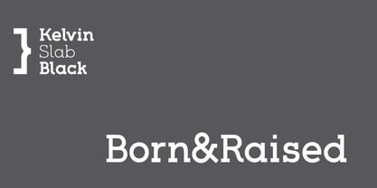
- HWT Slab by Hamilton Wood Type Collection,
$24.95 These two extra bold fonts are classic slab serif wood type styles with one detail of difference. Columbian is an extra bold Clarendon wood type that was manufactured by many of the wood type manufacturers in the late 19th century. "Clarendons" feature bracketed or rounded serif joins whereas "Antique" was a class of typefaces that features squared off slab serifs. Some type designs have only minor differences from others. The Columbian design is essentially identical to Wm. Page & Co.'s "Antique no. 4", with the difference being the bracketed serifs. In researching material for the digitization of Columbian, we started with a 15 line font identified as "Columbian" shown in the Angelica Press wood type portfolio (printed in 1976). This font is in fact "Page Antique no. 4". Comparing Antique #4 to Columbian specimens from Hamilton and other manufacturers confirms the only real difference is the serif treatments. Therefore, both fonts are presented as a pair. Each font features a full Western & Central European character set.
 - Grenale Slab by insigne,
$- Grenale Slab adds to the new standard of elegance within the Grenale family. Not your typical slab, Grenale has some unique forms that give it a look all its own. This glamourous slab still draws much inspiration from Grenale’s Didone sans and its haute couture influence. Independently attractive, it’s balanced and poised, with well formed strokes. Grenale Slab’s thin weights are simple but vibrant--elegant forms that naturally lend themselves to designer journals and high-end branding along with upscale applications. With added energy and power, the thicker weights give your work a firmer, statlier look. Grenale Slab’s upright versions are also matched by optically adjusted italics. The fashionable typeface includes a multitude of alternates that may be accessed in any OpenType-enabled application. The stylish features include a large group of alternates, swashes, and meticulously refined details with ball terminals and alternate titling caps to accessorize the font. Also included are capital swash alternates, old style figures, and small caps. Peruse the PDF brochure to see these features in action. OpenType enabled applications such as the Adobe suite or Quark can take full advantage of the automatic replacing ligatures and alternates. This family also offers the glyphs to support a wide range of languages. Any of Slab’s weights also provide a well-matched companion to its original counterparts, Grenale #2 and the original Grenale. It’s time to think high-class. Graceful and assured, the carefully crafted forms of Grenale Slab step pleasantly onto each page with elegant charm. Include its range of alternate glyphs, and this chic font is a superb choice for bringing a far more refined look to your copy.
 - Umba Slab by TypeThis!Studio,
$29.00 The best thing about Umba Slab is its surprise! UMBA Slab is a clean but eye-catching typeface designed by Anita Jürgeleit. It adds an amazing touch to your corporate design and titling by developing a more dynamic shape from thin to bold. It’s especially designed for a wide range of variety and to create a highly recognizable branding and titling. Twenty styles from thin to bold and matching italics help you to create design with a strong essence. Separate styles for alternate and small caps will show up in your font menu, making sure that you always stay aware of the wide range of possibilities of your new favourite font. Finally, for all those who love caps, there are extra caps-only fonts added to the collections. Would you like to see more of how UMBA can improve your design? Let’s get in touch! INSTAGRAM @anitajuergeleit +++ FACEBOOK AnitaJuergeleitTypefaces
 - Franqueline Slab by Sudtipos,
$39.00 Introducing Franqueline Slab, the captivating new typeface family passionately designed by Estudio Vástago and expertly distributed by Sudtipos! This versatile font offers a diverse array of styles, ranging from delicately refined to boldly eye-catching on the weight axis, all elegantly inspired by the timeless Egyptian fonts of the late 19th century. With expressive character and exquisitely unique shapes, Franqueline Slab harmoniously blends the finesse of its delicate strokes with sophisticated endings, resulting in a truly remarkable typography. Every letter in Franqueline Slab has been meticulously crafted to strike the perfect balance between a contemporary edge and a touch of traditional charm, appealing to both the younger generation and typography enthusiasts who appreciate the artistry of the past. Its adaptability makes it ideal for captivating headlines that convey a message of youthful energy and playfulness, while still exuding the timeless elegance that only classic fonts can deliver. Embrace distinction and originality in your designs with Franqueline Slab. Whether it graces an editorial project, logo, or advertising material, this exceptional typeface family will undoubtedly stand out, leaving a lasting impression with its captivating personality. Watch your messages come to life and shine with the unparalleled charm of Franqueline Slab!
 - Silo Slab by TypeUnion,
$25.00 Designed and built in London by TypeUnion, Silo Slab is a fluid slab serif typeface embodying energetic curves and a clean, functional structure. The Silo Slab Family is made up of 6 weights, which range from a delicate Extra-Light, all the way through to a punchy, loud Extra-bold and each carry a versatility for multiple applications and uses. Each weight has a matching italic. Silo Slab features open type alternate characters, and extensive language support to provide a flexible, substantial user experience.
 - TT Slabs by TypeType,
$29.00 TT Slabs update 1.110 What’s new: Case Sensitive Forms Tabular Figures Fractions Numerators Denominators Superiors Scientific Inferiors TT Slabs useful links: Customization options | Instagram | Facebook | Website About TT Slabs: World needs a beautiful, simple and high-quality fonts. We need simple and geometric fonts. Slab is a form of serifs, which gave its name to the font family. If you are looking for a versatile font with wide proportions for your projects—TT Slabs will suit you perfectly. Optimized for the websites, mobile applications, and printing materials. We offer you to have a look at this font’s narrow version—TT Slabs Condensed. TT Slabs language support: Acehnese, Afar, Albanian, Alsatian, Aragonese, Arumanian, Asu, Aymara, Banjar, Basque, Belarusian (cyr), Bemba, Bena, Betawi, Bislama, Boholano, Bosnian (cyr), Bosnian (lat), Breton, Bulgarian (cyr), Cebuano, Chamorro, Chiga, Colognian, Cornish, Corsican, Cree, Croatian, Czech, Danish, Embu, English, Erzya, Estonian, Faroese, Fijian, Filipino, Finnish, French, Friulian, Gaelic, Gagauz (lat), Galician, German, Gusii, Haitian Creole, Hawaiian, Hiri Motu, Hungarian, Icelandic, Ilocano, Indonesian, Innu-aimun, Interlingua, Irish, Italian, Javanese, Judaeo-Spanish, Judaeo-Spanish, Kalenjin, Karachay-Balkar (lat), Karaim (lat), Karakalpak (lat), Kashubian, Khasi, Khvarshi, Kinyarwanda, Kirundi, Kongo, Kumyk, Kurdish (lat), Ladin, Latvian, Laz, Leonese, Lithuanian, Luganda, Luo, Luxembourgish, Luyia, Macedonian, Machame, Makhuwa-Meetto, Makonde, Malay, Manx, Maori, Mauritian Creole, Minangkabau, Montenegrin (lat), Mordvin-moksha, Morisyen, Nahuatl, Nauruan, Ndebele, Nias, Nogai, Norwegian, Nyankole, Occitan, Oromo, Palauan, Polish, Portuguese, Quechua, Rheto-Romance, Rohingya, Romansh, Rombo, Rundi, Russian, Rusyn, Rwa, Salar, Samburu, Samoan, Sango, Sangu, Scots, Sena, Serbian (cyr), Serbian (lat), Seychellois Creole, Shambala, Shona, Slovak, Slovenian, Soga, Somali, Sorbian, Sotho, Spanish, Sundanese, Swahili, Swazi, Swedish, Swiss German, Swiss German, Tagalog, Tahitian, Taita, Tatar, Tetum, Tok Pisin, Tongan, Tsonga, Tswana, Turkish, Turkmen (lat), Ukrainian, Uyghur, Vepsian, Volapük, Võro, Vunjo, Xhosa, Zaza, Zulu.
 - Haboro Slab by insigne,
$- Haboro Slab. It’s a nose-to-the-grindstone kind of font like the first of its family. This slab serif pushes through the clutter powerfully in editorial and corporate work such as business websites and software. The Haboro hyperfamily as a whole is known for its ability to make the work clear and simple, even with the fonts’ advanced angle--and Slab is no change here. Consistent with Haboro, too, the simplified geometric features of the slab face just make sense, no matter where you use it. Its timeless wedge-molded serifs give this family the formula it needs to function flexibly in jobs from fashion to packaging. Enhance your output with the font’s wide range of ligatures and alternates, including OpenType alternates. Use Haboro Slab’s large pair of solution glyphs and various other OpenType specifics, too, to give your message the clarity it deserves. Even more, it couples well with the sophisticated didone of the Haboro hyperfamily to further expand your capabilities. Haboro Slab has every quality you need for successful lettering. Use this modification on a classy tradition to mold and shape your next layout, whether website, iPhone app, advertising, or newspaper. There is no work Haboro Slab won’t power through.
 - Ciutadella Slab by Emtype Foundry,
$69.00 The family keeps growing, Ciutadella Slab is the ‘serif’ counterpart of the popular Ciutadella font. The former alternate characters like 'a', 't' and '&' are now the default ones (and the former default characters are now the alternates), giving way for a typeface more suitable for texts. Thus, the new Ciutadella Slab is not only a great headline family, it will also work in texts of intermediate length and size. Especially appropriate for magazines, brochures or branding. This new addition provides even more versatility to the family started with Ciutadella and Ciutadella Rounded. It is available in Open Type format and includes Alternate Characters, Ligatures, Tabular Figures, Fractions, Numerators, Denominators, Superiors and Inferiors. It supports Central and Eastern European languages. As the sans version, the type family consists of 10 styles, 5 weights (Light, Regular, Medium, SemiBold and Bold) plus italics. For more details see the PDF.
 - Kompot Slab by VP Creative Shop,
$20.00 Introducing Kompot - This is the Greatest Font... actually typeface with 2 styles Kompot Slab is swirly, vintage typeface with 2 styles to enchant your next project. They are loaded alternate glyphs and multilingual support. Very versatile fonts that works great in large and small sizes. Basic latin, advanced latin, basic Cyrillic and advanced Cyrillic character sets are supported! Kompot Slab is perfect for branding projects, home-ware designs, product packaging, magazine headers - or simply as a stylish text overlay to any background image. Uppercase numeral, punctuation & Symbol Regular Outline Alternate glyphs Multilingual support Basic and Advanced Cyrillic support How to access alternate glyphs? To access alternate glyphs in Adobe InDesign or Illustrator, choose Window Type & Tables Glyphs In Photoshop, choose Window Glyphs. In the panel that opens, click the Show menu and choose Alternates for Selection. Double-click an alternate's thumbnail to swap them out. Feel free to contact me if you have any questions! Mock ups and backgrounds used are not included. Thank you! Enjoy!
 - Bommer Slab by dooType,
$15.00 Bommer project started in January of 2014 and I am happy to announce the first family - Bommer Slab - is now ready for release. This family includes 14 weights - being seven uprights and seven italics. This font has a strong personality, that makes it perfect for use in headline sizes but means it also works gracefully within text blocks.
 - Adagio Slab by Borutta Group,
$25.00 The Adagio Family is a part of Mateusz Machalski’s, Warsaw Academy of fine arts Master Degree Diploma in multimedia studio, conducted by Professor Stanisław Wieczorek and his brave PhD student Jakub Wróblewski. Adagio is a modern type family. It consists of 3 main varieties: sans, serif and slab. Each has its own “true italic” set. All of the styles together have over 400 characters in 9 different thicknesses. The Adagio family was created mostly for company identities. The idea was to create a wide range of different varieties that are stylistically consistent. Adagio Slab - Slab variety combines qualities of the Sans and Serif varieties. It has the same contrast as Sans. As distinct from Serif, Adagio Slab contains strong, beamy and symmetrical serifs in the form of pillows. Thanks to large X height, and highly stretched descenders, it also works correctly in longer text, while its strong detail is good for headlines. Slab version is a great complement for Adagio Serif and Adagio Sans.
 - Eroika Slab by Eclectotype,
$40.00 Eroika Slab is a robust, display serif, intended to be set large. While for most serifs, display means high contrast, Eroika's "displayness" stems from its wide stance, tight spacing, equal cap and ascender heights, flared stems and large x-height. The italics in particular are quite unorthodox, with their vertical serif cut-offs and foot serifs where most fear to tread ('scuse the pun). All fonts feature a useful array of stylistic sets, oldstyle figures, automatic fractions and case sensitive forms. All ligatures are in the discretionary section, as it's my belief that this typeface looks better without them, but I like to offer the choice. Perfect for book covers, craft beer logos, boxing paraphernalia and tattoo magazine pull quotes. And probably a whole lot more besides!
 - Isento Slab by DSType,
$40.00 We always wanted to design a gothic typeface. Our most similar typefaces are Rude and Firme, but Rude has some very delicate curves especially visible in the vertical strokes and Firme introduces a type family with reasonably big ascenders and descenders. On the other hand, Isento has a much more straightforward approach to the particular genre. Loosely inspired by Times Gothic, introduced in the American Type Founders Specimen Book and Catalogue from 1923, soon followed its very own path. Is our first typeface that clearly shows a distinct weight difference between the uppercase and the lowercase and the spacing is very open to provide a much more mechanical feeling. Isento and Isento Slab ranges from Thin to ExtraBold with perfectly matching italics. Immediately seemed very clear that a slab serif companion would follow the sans, therefore Isento Slab is the perfect companion to Isento, with very strong rectangular serifs, ideal to set short passages of text or to become the key actor in a big headline.
 - Anultra Slab by Eclectotype,
$40.00 Anultra Slab is, you guessed it... An ultra bold slab serif! Anultra Slab is a hard hitting headliner, designed to be set LARGE. Because it's a single weight typeface, no compromises were necessary to get it interpolatable with other weights, so it is as bold and tight as I intended. Features include automatic fractions, case-sensitive forms, ligatures, stylistic alternates for non-descending J and Q, and a 3D 'xtrude' style, which can be layered behind the regular to create two colour, photo-lettering style text. Very seventies. Very cool. A companion typeface, Alight Slab , is available at the other end of the weight scale, but there are no weights in between. You're no middle-weight designer, so why use middle-weight fonts?!
 - Kotto Slab by Picador,
$29.00 Ultra Heavy Weight Font Champion – that's Kotto Slab. Bold curves and catchy endings. You can always count on Kotto – quirky posters, creative projects or long texts. That doesn't matter. Easy to use and easy to pair with other typefaces. Matching italics and opentype features will make your work faster. Try it with sans and serif fonts, especially with Praho Pro – you won't regret it.
 - Paul Slab by artill,
$29.00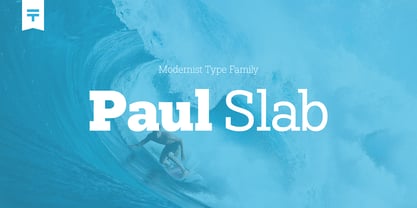


Page 1 of 177Next page